Reading a Race Poster from Top to Bottom
Learn how to read a race poster from top to bottom by tracing its hierarchy, lettering, colors, and imagery without mistaking design for event history.
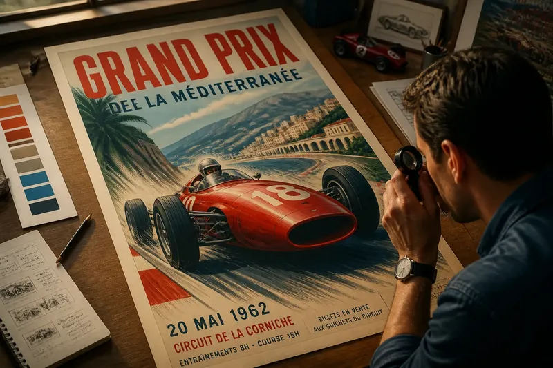
A race poster can make a circuit feel fast before you have noticed a car. To read a race poster from top to bottom, follow the order in which its design asks for your attention: first the largest shapes, then the lettering, color, image, and small print. That sequence reveals how the poster constructs an impression, not what the event itself was like.
What catches your eye first?
Start by looking at the poster as a whole, from a comfortable distance. Resist the urge to read every word. Note the first thing you see, the second thing, and the place your eye settles after that. A name, a car, a bright block of color, or a diagonal stripe might lead. The sequence is the poster’s visual hierarchy: the relative prominence and order of its parts.
Now look for the largest dark and light areas. A compact block of lettering can outweigh a much larger illustration if its contrast is stronger. A bright car against a pale field may command attention before the event name, even if the name is the poster’s stated subject. Size matters, but it is only one part of the arrangement.
Try a simple way to check the hierarchy: half-close your eyes or view the poster as a small thumbnail. Fine details disappear, while the main shapes remain. If the event name still reads clearly, it likely has a strong position in the design. If the car or a patch of color takes over, that is not a failure; it tells you what the poster chooses to sell first.
Imagine a poster with a large red car angled upward, a narrow event name across the top, and a small date near the foot. From across a room, the car is likely to register first; at closer range, the name and date become legible. The expected observable result of this reading is a clear order of attention, not a verdict about how important each element was to the event.
Where does the lettering send you?
Next, trace the lettering from the top edge downward. Notice whether the event name sits above the image, crosses it, or shares space with a sponsor or circuit name. Placement can make one label feel like a title and another like a caption. A line tucked into a corner may be secondary, even when it contains useful information.
Look at letter shape before trying to identify a typeface. Are the letters narrow or broad, squared or rounded, upright or slanted? Do they feel mechanical, formal, playful, or restrained? These are observations about visual character, not proof of a particular era, workshop, or designer.
Then compare the type’s weight and spacing. Heavy letters hold their ground against a busy image. Thin lettering can look elegant but may recede when placed over a detailed background. Tight spacing makes a word read as a dense unit; generous spacing gives it air, though it can also make a short name seem less urgent.
Follow any changes in lettering across the poster. An event title might use block capitals, while the venue appears in a quieter face and the date in plain type. That contrast separates roles. If every line is large, bold, and emphatic, none of them can reliably take the lead; the page has the visual equivalent of several people speaking at once.
Pay particular attention to lettering printed over an illustration. A word may sit in a clear strip of sky or track, or it may cross a car body where edges and shadows compete with its strokes. Ask whether you can read it without effort. The answer helps explain how the design balances information against spectacle.
How do the colors organize the page?
Move from type to color, but do not start by naming every shade. First identify the dominant color, then its strongest contrast, and finally any small accent. A limited palette can create a firm visual rhythm; a crowded palette can make separate objects feel joined or competing, depending on how the colors are placed.
Notice where the most vivid color appears. If it is on the car, the vehicle becomes the poster’s visual anchor. If it belongs to the title, the words may lead instead. A single accent repeated in a flag, a wheel, and a line of type can link those elements, even when they sit far apart.
Also distinguish color from light and dark. Two colors can have similar brightness and blur together at a distance, while a muted color against a dark field can stand out sharply. Squinting is useful here too. If the composition loses its separation when you do, the poster depends on color differences that may be subtle rather than on clear changes in tone.
A racing poster’s palette can suggest speed, heat, precision, or ceremony. Those are effects of visual choices, not reliable descriptions of the event’s conditions. A fiery orange background does not tell you whether the day was hot, and a cool blue field does not establish that the racing was calm. Treat color as part of the poster’s persuasion.
What is the image asking you to imagine?
Now inspect the central image. Decide whether it is a photograph, a drawing, a simplified graphic, or a mixture. Then look at the angle: a car seen from low down may appear imposing, while a profile can make its shape easier to read. A blurred background or repeated lines can imply motion without showing what happened on track.
Notice what the image leaves out. A single car against an empty field offers a different impression from a crowded pack or a grandstand scene. Cropping matters too: a cut-off wheel, wing, or body panel can make the vehicle feel as if it continues beyond the poster. None of these choices establishes how many cars entered, where they ran, or what unfolded during the event.
Look for signs that the image has been arranged to work as a poster. Cars may be enlarged relative to buildings, track markings may curve more dramatically than they would from a neutral viewpoint, or the horizon may tilt. Such choices can make a small printed surface feel active. They tell you about composition, not necessarily about the circuit’s actual layout.
Compare the image’s direction with the page’s direction. A car pointing toward the center can draw the eye back into the design; one aimed at the edge may seem to rush out of it. A diagonal track or plume can carry that movement toward the title or date. This is a useful way to see how an illustration connects sections of the poster rather than merely decorating them.
Which details belong to the event information?
After reading the large elements, move down to the smaller print. Look for the venue, date, session or race name, ticket information, and any organizer or sponsor marks. These details often sit at the bottom or along an edge because they answer practical questions after the image has caught attention.
Separate what the print states from what the design suggests. A venue name is a readable claim about location; a dramatic circuit drawing may be an emblem or stylized scene. A sponsor mark identifies a relationship presented on the poster, but its placement alone does not explain the sponsor’s role. Treat small print as information to inspect, not as decorative texture.
Check how the details relate to one another. Is the date visually attached to the event title, or does it appear to belong to a separate block? Does the venue name sit near a map-like image, or does it stand alone? Alignment and spacing can clarify which words form a unit. If the grouping is ambiguous, note the ambiguity rather than silently completing the message yourself.
Where a poster is faded, cropped, or reproduced at low resolution, distinguish what you can read from what you infer. A partly obscured line may be a date, a location, or a sponsor. Record the visible form in your own notes and leave the uncertain reading open. A confident guess does not become useful information merely because it fits the layout.
What can a close reading tell you?
Once you have moved through the poster, describe its choices in plain language. You might say that the car leads, the title follows, red links the image to the type, and the venue is tucked into the lower edge. That description is more precise than calling the poster “fast” or “dramatic” on its own, because it explains which visible decisions create the effect.
Keep design interpretation separate from event history. A poster can show a racing car, a track, a date, and a venue, but its image may be symbolic, edited, or made for visual clarity. It should not be treated as a record of track conditions, the race’s outcome, the cars that appeared, or the crowd’s experience unless separate evidence supports those claims.
The same restraint applies when comparing two posters. You can compare their hierarchy, lettering, palette, image treatment, and information placement. You can say one makes the circuit name more prominent or uses a tighter palette. Avoid turning those visual differences into claims about which event mattered more or which audience attended.
Think of the poster like a shop window: its arrangement tells you what it wants you to notice, not everything that happened behind the glass. The analogy is modest, which is useful. It keeps the design’s persuasive purpose in view without making the poster sound like a transparent account.
What questions help you read a racing poster?
Should I read the words before looking at the image?
Begin with the whole composition, then read the words in the order their size and placement suggest. This makes it easier to notice whether the image leads and the information follows, or whether the title anchors the page from the start.
Can the poster identify the exact car or circuit?
Sometimes its labels or recognizable details may point to a car or venue, but illustration can simplify or alter forms. Treat identification as tentative unless the printed information makes it explicit or another reliable source supports it.
Does a dramatic image mean the event was dramatic?
No. Perspective, cropping, color, and motion lines can heighten the image for visual effect. They describe how the poster presents the event, not what spectators or competitors experienced.
What should I do when small print is hard to read?
Note the words and letters that remain visible, and mark uncertain portions as unclear. Enlarging a scan may help you inspect it, but it cannot restore information that is missing from the image.
How can you make a useful note?
Use a short record that separates observation from interpretation. For example, write “large car at center, title in narrow capitals, orange repeated in the date block” before adding “the image feels forceful.” The first part can be checked against the poster; the second describes your response.
A compact set of prompts can keep that note specific:
- First glance: Which element catches your eye before you read?
- Hierarchy: What comes second, and what is easiest to miss?
- Lettering: Which words use the heaviest or most distinctive type?
- Color: Where is the strongest contrast, and where does an accent repeat?
- Image: What angle, crop, or implied movement shapes the scene?
- Information: Which event details are legible, and which remain uncertain?
These prompts are not a scoring system. A poster can be legible but visually quiet, or vivid but difficult to read. The point is to describe how it directs attention and where its information sits, not to rank it against an imagined ideal.
Reading a race poster from top to bottom gives you a way to appreciate its visual design while keeping its limits clear. Follow the hierarchy, inspect the lettering, track the colors, study the image, and finish with the small print. You will leave with a sharper account of what the poster shows and, just as usefully, what it does not establish.